The existing animation system in Godot was already one of the most powerful of any game engine, but its age was starting to show (it was written 10 years ago and barely improved). The new one builds upon the strengths of the previous one but does massive improvements to features and usability.
A bit of history
Animation editing was one of the first distinctive Godot features. If you are familiar with Godot, you may already know that any property from any object can be animated or tweened. Changing sprite textures, colors, animation frames, calling functions, playing animations in other animation players, playing sounds, etc. All is done transparently by simply animating property states.
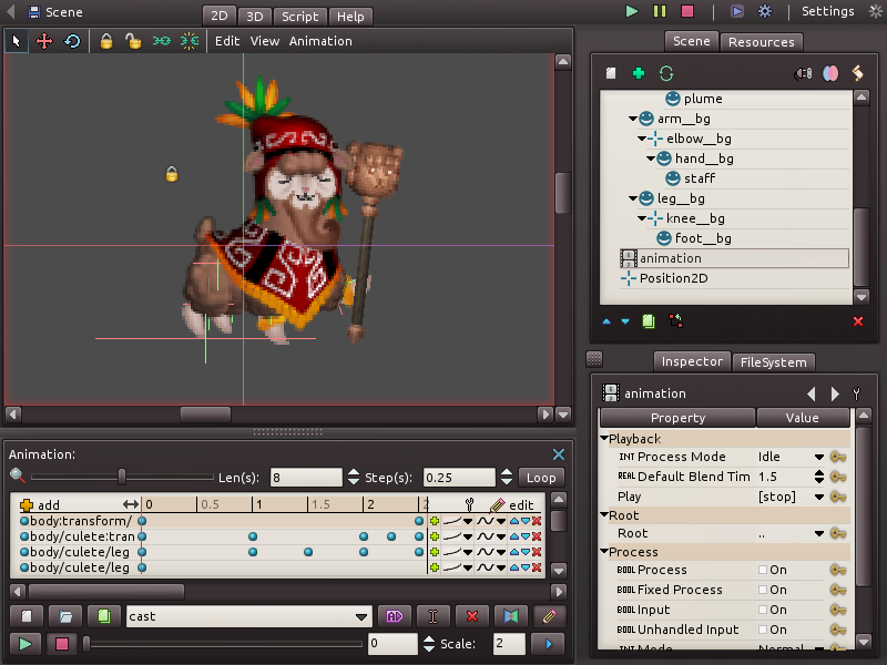
Although this approach works really well, it started showing its age as it was not improved very much in almost 8 years. The reason for this is that the code behind animation editing was too hard-coded in general, which made it difficult to add new features or improvements. In the image below, the animation editor can be shown as it was in 2010. Nothing much has changed since:
Rewriting from scratch
As it has been the trend the past months, with the rewrite of the 2D editor, inspector, etc., the time has come for a new animation editor to come forward. The new code is more modular, and allows extending track editing to show custom visualization. It also has a plethora of new features that will indeed be very useful.
With the new trend of cinematic tools and timelines coming recently to the big engines, this workflow (which was already possible) was cleaned up and made much easier and visual.
Following is the long list of changes and improvements included in the new animation editor!
New layout
First of all, there is a new layout (keep in mind the visuals are not final, and will be further refined by our UI styling contributors before 3.1).
The old layout wasted a lot of horizontal space in buttons that were seldom used. Buttons in large groups are, in general, not a very helpful usability convention so the whole layout was confusing. Some useful menus (such as add track) were hidden in the clutter, and the animation name had only a bit of space to show itself.
Some buttons were unnecesary, such as move up/down, which remained from the ages when Godot did not support drag and drop.

The new layout is much simpler and has moved most functions to menus. Only the really important buttons remain visible. The animation length and loop options are now together in the timeline, as well as the button to add tracks.

The step field was confusing, so it was renamed to a snap button. Snapping can now be toggled on or off.
New track workflow
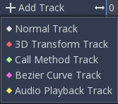
Besides the usual workflow of inserting keys (and creating tracks) from the inspector, new tracks can be created directly from the Add Track menu. This not only provides an alternative workflow, but works much better for non-property tracks, such as Call tracks and the new Bezier, Audio and Animation tracks.
Keys can also be inserted at any position in the timeline by simply right-clicking over the track at a given position in time.
Adding a Call track and calling a function, as an example, is a lot more intuitive:
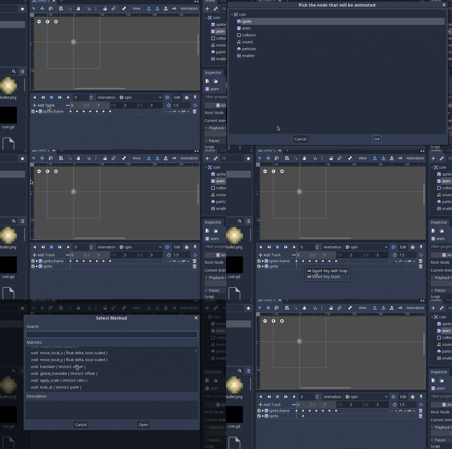
Just trust this new menu, as it will always lead you through the right dialogs to get your tracks set up in no time!
Key editing in inspector
The old layout had a small sub-window where key values as well as transition curves could be edited for each key. Most users did not even know this feature existed due to the huge amount of clutter.
In the new animation editor, just clicking a key will allow editing it in the inspector:

Key previews
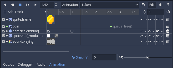
Most types of keys can have their values previewed directly in the track, thanks to track editor plugins. Godot comes with a bunch of built-in ones for most key types.
As an example, editing animation frames is a lot more friendly now:

As well as many other key types, such as:
- Boolean tracks
- Color tracks (which show colors and transitions)
- Call tracks (which show the function and arguments)
- Stream playback (shows a stream preview)
- Volume DB (shows a gradient with the volume)
Bezier Tracks
To be more in line with other software and thanks to the work done by Bojidar Marinov on set/get indexing for tweens, it is now possible to create Bezier tracks.
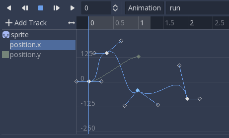
These are normal tracks and look like regular tracks that edit a single float component:

But with the push of a button, it is possible to edit the Bezier curves directly in the integrated bezier editor!
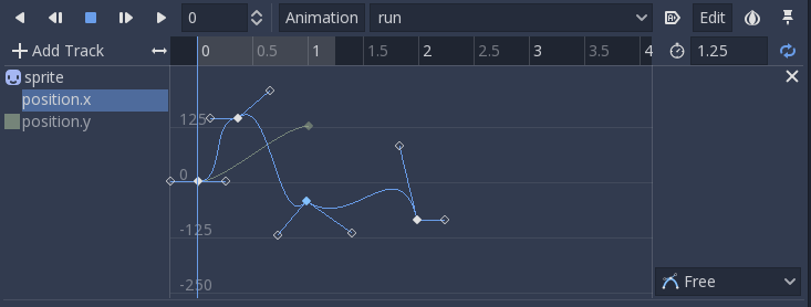
Related tracks in the same object will appear in the background for reference, and switching between them is easy with the menu on the left.
Animation and Audio tracks
Two new track types were added: Animation and Audio. Animation tracks need to point their path to an AnimationPlayer node (must be different from the current one). Audio tracks need to point to an AudioStreamPlayer node (can be AudioStreamPlayer, AudioStreamPlayer2D or AudioStreamPlayer3D).
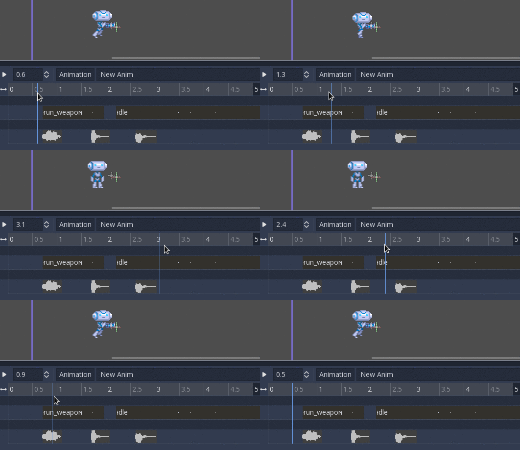
Audio tracks work very similar to a DAW. Just draw audio resources into the animation track and it will play them back. Editing their start and end offset is allowed, to better adjust the sound to the rest of the animation.

This workflow is very smooth, and previews of the audio are rendered in a thread to not obstruct your work, just like in a real DAW!
For animations, just insert current animation keys in the same way as before, but now they will be previewed with full length on the timeline.
Added to that, the new tracks are designed to work better with seeking, so you can seek (via code or editing) to any point of the master animation, and both audio and sub-animations will start from the right offset:
To also help with this workflow, the currently pinned animation editor is displayed in the Scene Tree:

All this together makes Godot’s built-in animation support the most powerful tool for in-game cinematic creation and editing. This goes in-line with Godot’s philosophy of having a single, powerful and well designed tool instead of several ones duct taped, like in other engines.
Track grouping and filtering
This has been a long-standing request. It is now possible to see tracks grouped together by object. This makes complex animations with lots of tracks much less confusing.
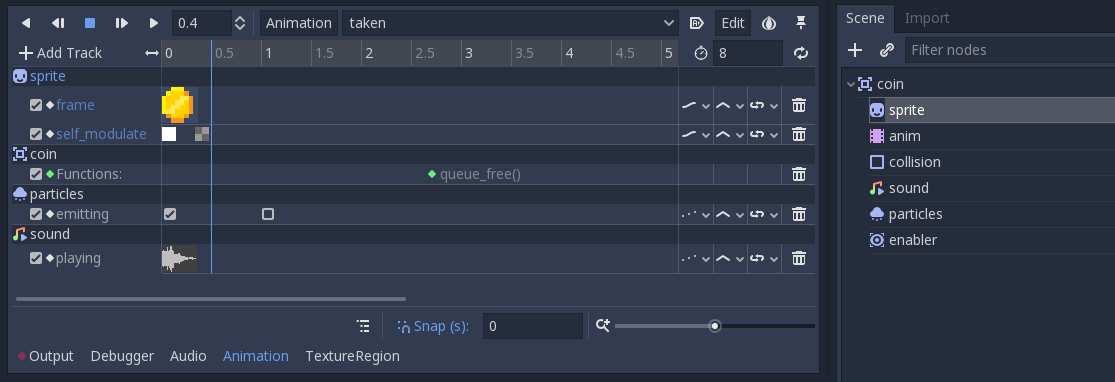
It is also possible to filter tracks with the push of a button. When filtering is enabled, only tracks selected in the Scene Tree dock will appear editable.
Track copying and pasting
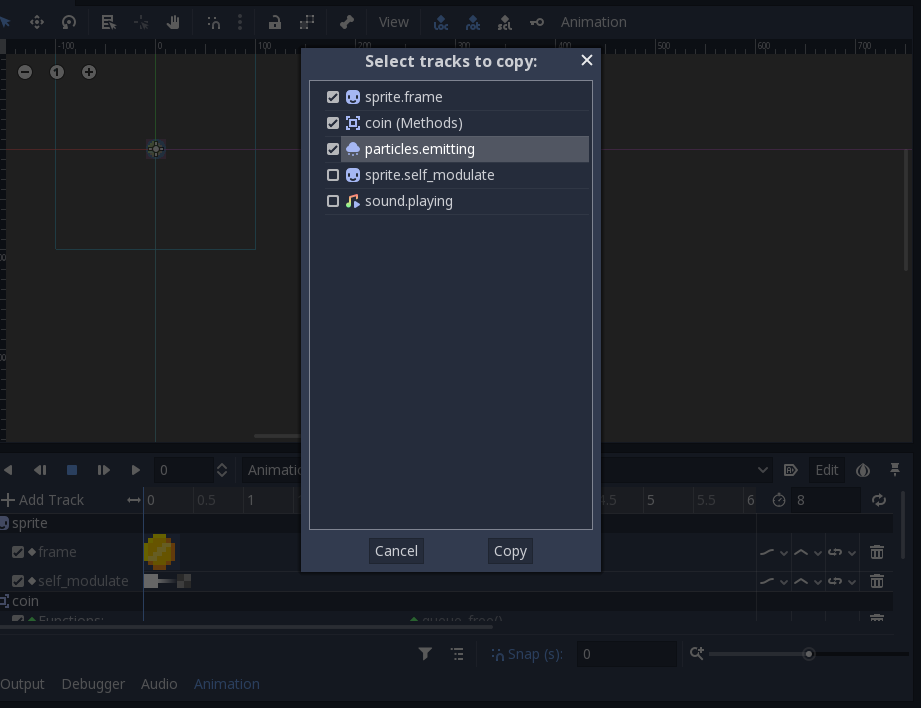
Another long standing request is the ability to copy and paste tracks between animations. this has been made much easier with the new copy/paste menu:
Capture Mode
The last significant feature introduced in the animation editor is capture mode for property tracks. When these tracks are set to capture, the current property value in the object is remembered. From there onward, it will blend with the first animation key found:

The main use of this feature is for animating UI components (as in, menus sliding in an out, buttons becoming bigger or smaller, etc.) without having to resort to tweens. Still, it can be used with anything else, so I’m sure that other creative uses will arise.
Future
Please test this code well (it’s now available on GitHub HEAD) so all the bugs can be ironed out before Godot 3.1 is out!
Some features were left out due to lack of time, but may be implemented later, such as a global track (for ease of selecting long list of keys). Others are still in the works (like proper auto-keying).
And again, please remember that Godot is made with love for everyone! If you haven’t yet, please consider donating and becoming our Patron!
